As per IDC Worldwide Global Data Sphere Forecast, 2021–2025, business and consumer data is expected to reach 180 zettabytes by 2025. As raw data increases, understanding and making sense of it can be challenging. For data to be useful for organizations and businesses, businesses need to be able to understand data to draw insights from it and use it productively. Visualizing data using various data visualization tools helps in managing and understanding data in a better way.
We will discuss how visually representing data in the form of various charts and graphs helps understand data better.
How Is Visualizing Data Useful?
Data visualization is defined as creating visuals to represent data in a better way. Visualizing data helps us better understand and quickly make sense of data. For the purpose of visualizing data, various data visualization tools are used.
By using visualizations effectively, organizations can quickly identify new and emerging opportunities as well as current gaps that can be improved to enhance the overall output of the organization. They can also create existing products or services or add new products or services to their portfolio of market offerings hence diversifying their revenue streams.
Data visualization is not just limited to organizations and businesses. It is also used to communicate relevant but complex information to the stakeholders. Visualizing data is also reshaping public policy and is used to share vital information with the public on a governmental level using various indexes.
How Visualizing Data Helps Uncover Key Insights?
Visualizing data helps people better understand difficult, lengthy and complex information by representing it in a visual context. After collecting, processing, and modeling data, visualization forms a relationship between various data sets and draws conclusions from them.
Visualizing data is more suitable for the human brain as well because the human brain processes visuals 60,000 times faster than plain simple text. That’s why infographics are far easier to remember.
These days organizations are becoming more and more data-driven because intelligent and effective application of data drives growth. Visualizing data helps organizations in scaling more efficiently and posting better results. Data-driven organizations are consistently more solution-oriented than regular traditional companies.
1. Enhances Productivity
Visualizing data helps in processing and understanding information much faster and efficiently. It reduces the time spent per meeting, decreases time spent in figuring out underlying problems, and boosts overall organizational productivity.
According to McKinsey & Company, one metal manufacturing company increased its production rates in one of its production lines by up to 50 percent by mapping out data and using real-time performance visualization in its operating stations.
2. Identify Hidden Issues
Data visualization has given organizations the power to quickly evaluate performance and identify core areas that need improvement to enhance the overall business or organization’s performance.
For example, a brand team looks at ad data and identifies that impressions and clicks dip on weekends incurring extra costs for the brand, so they turn off ads on the weekends. Since this will affect the overall performance and ROI, the brand team will now just have to tweak the timings and days when the ad is served as they are already aware of the problem.
3. Pattern Identification
Analyzing patterns in a business can help managers identify the underlying bottlenecks in various processes. Patterns are repeated over a period of time in cycles. These patterns help organizations analyze, forecast, and predict future trends. Various stocks, bonds, and organizational performances follow different patterns. Hence pattern identification allows us to prepare for the upcoming predicted events in advance.
Five Ways to Visualize Data
Various methods and techniques are used to visualize data. A list of five of the most commonly used ways to visualize data is given below. They aren’t just the most common ways. In fact, they are also the easiest methods to implement for effective data visualization.
1. Column Charts
Column charts are also commonly known as bar graphs. Visualizing data using column charts is as easy as it gets while representing data. They are taught to students as early as second grade. Here are some common uses for column charts:
- Column charts are usually used to show the number of subsets present in a particular set.
- They typically are used for the side-by-side analysis of different values present in the raw data.
- Column charts are also used to visually represent change over a period of time.
Another option in column charts is stacking multiple columns for tracking the frequency of an event across a specified length of time. In short, bar charts or column charts are a great way to measure differences between various data sets or how a particular data set changes with respect to time.
An example of use of column charts in data analysis is analyzing sales data to figure out which products are selling the most and which are selling least. This data can also be utilized to forecast future sales and manufacturing enough products to meet supply and demand.

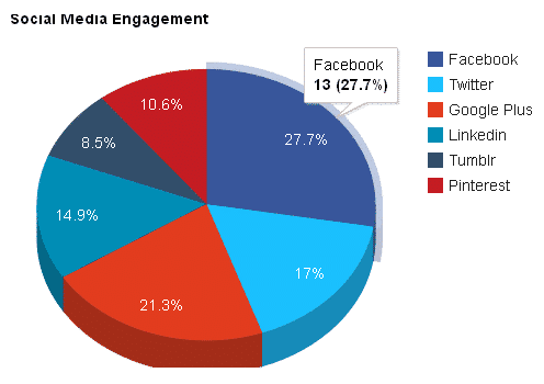
2. Pie Charts
Typically a pie chart looks like a circle that is sliced in different sizes. Each slice represents a specific share of percentage. If all the portions of all the slices are summed together, they would sum up to a total of 100.
Pie charts can be used to represent the marketing campaign that is bringing in the most traffic or any other desirable metrice. Just one look at a pie chart would tell your marketing team which campaign is generating the most results.
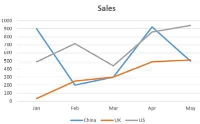
3. Line Charts
Line charts are also commonly named as line graphs. They are popular for a variety of uses. Visualizing data and then understanding and processing data that is visually represented in the form of line charts concisely shows an overall trend.
These trends help managers understand which direction sales, or stock prices, or any other variable is going. They can then take action accordingly and make much more informed decisions.
The line chart given below shows sales data of various countries. On the Y-axis is the sales volume and on the x-axis is the month. Each country is represented by a line of different colour on the map.
4. Scatter Plot Charts
Scatter plot charts are also known as scatter charts. They are used to visualize data related to distribution and relationships between various variables using a large number of varied data points.
They represent data using circles. Data category is represented by the circle’s color and data volume by the size of the circle. The bigger the size of the circle means that data has more volume.
The scatter plot chart plotted below shows the prices of diamonds on the Y-axis and carats on the X-axis. Each dot on the graph represents the price of a particular carat of diamond. These dots then help data analysts analyze the direction in which the trend is moving and prepare accordingly.

5. Area Sector Map
Area sector maps are used to divide data in the form of different geographical areas or locations. They represent which geographical locations are most important to your business. Data is visualized by circles of various colors, while values are represented through the size of the circle.
Area sector maps can be utilized to see the areas or regions that are generating the most sales. Marketing teams can then utilize this information to focus more on that region to enhance sales.
The area sector map given below shows the region-wise sales in Europe. Each color of the circle represents a particular number of sales. Data analysts can quickly analyze the sales trend according to the area by just looking at the graph, and then marketers can take necessary actions accordingly.

Conclusion
In this age of data and insights, visualizing data can mean the difference between a successful and an unsuccessful brand. Visually representing data in an optimal manner can enhance the likelihood of understanding and processing information much better. Various methods of visualizing data have different use case practices, and businesses need to identify the proper process that fits their needs.
Visualize Your Data With Accurate Digital Solutions
Visualizing data can be tricky, especially if you don’t know where to start. Accurate Digital Solutions has helped dozens of businesses visualize data to help them attain better results.
If you’re confused about getting started with data visualization, contact us and get professional help in converting your raw data into refined visually represented information.